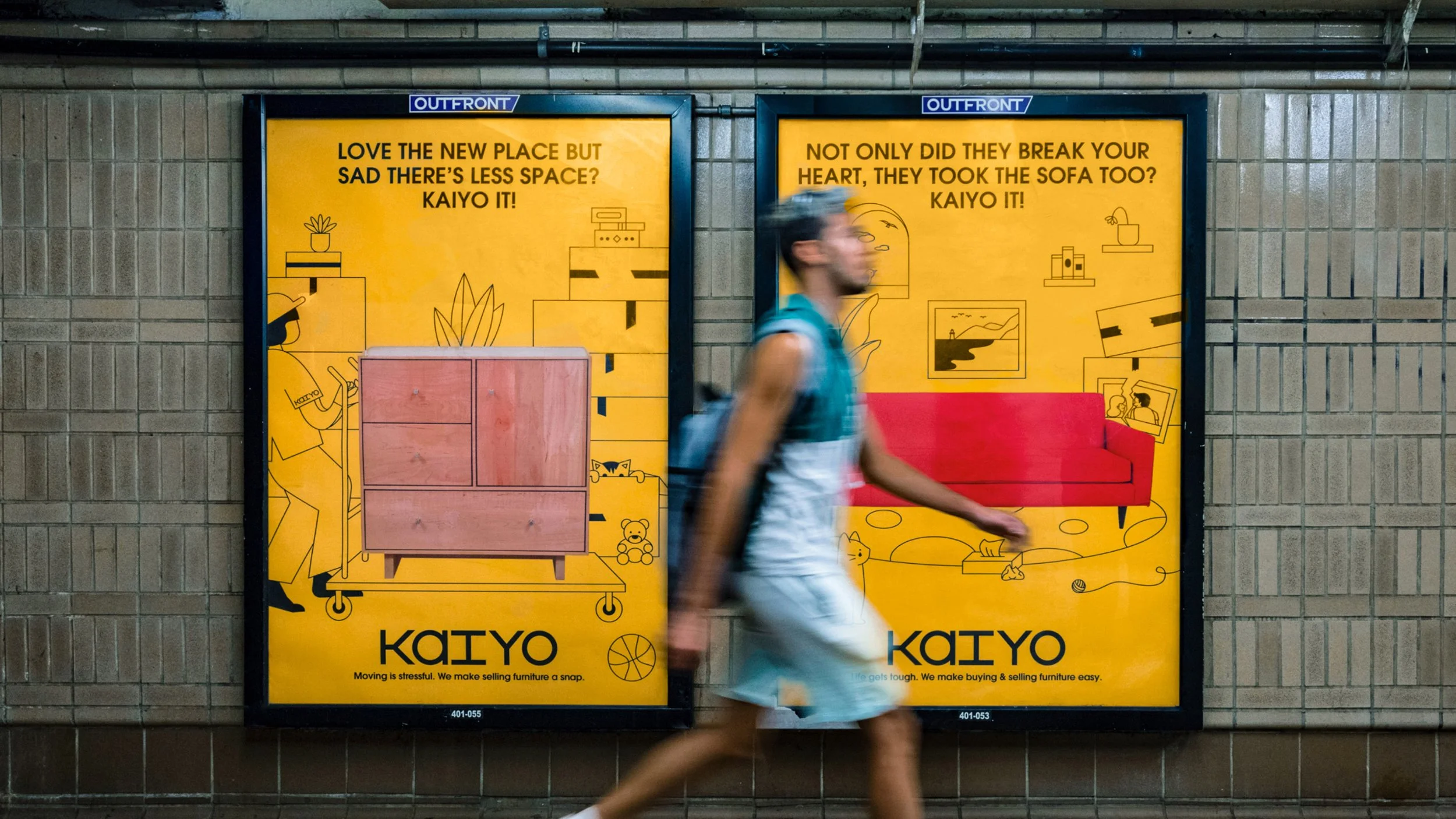
‘Kaiyo It!’
The Challenge
Kaiyo It! is an ad campaign that plays off the challenges of New York living and turns the brand name “Kaiyo” into a call to action. The ads feature playful illustrations of domestic scenes that center on a silhouetted photo of the piece of furniture in question, set against the saturated yellow of the Kaiyo branding. The series is running as digital animations in street kiosks and as static posters on the subway, where it greets New Yorkers who are ready to reassess their living situations after the lockdown. The company wanted a distinctive concept it could truly own, something that was simple, memorable and easy to say.
The Solution
The illustration is the key visual for this project. As a lead designer in this project, I created all the illustrations and motion behaviors based on the 4 concepts that aligned with the strategy team at Pentagram Design. The ads feature playful illustrations of domestic scenes that center on a silhouetted photo of the piece of furniture in question, set against the saturated yellow of the Kaiyo branding.
Launched in New York Subway, No Mockup!
Credit on the Pentagram Design blog


